Components
All the React components are made with TailwindCSS.
Themes
By default, 2 themes are enabled: light & dark. It will automatically switch based on the user's preferences.
To change or add themes:
- Add/remove themes in
tailwind.config.js>daisyui.themes(keep at least one) - Add the theme name to the config.js file in
theme&mainconfig.js
1colors: {
2  theme: "YOUR_THEME",
3  main: themes[`[data-theme=YOUR_THEME]`]["primary"],
4}
Here is a list of the 20+ available themes
Custom components
All custom-made components are inside the /components folder of your ShipFast repo. Each component is documented in details in the code and in this documentation.
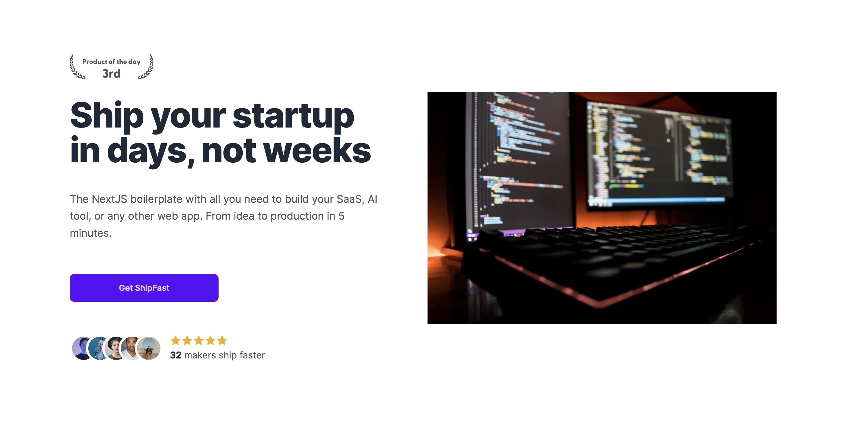
Example: This is a Hero component.

daisyUI components
ShipFast uses daisyUI as a UI kit for simple components like buttons, inputs, tabs, etc. Here are all the daisyUI components.
Example: Add className: "btn btn-primary" to display this button:
Animations
Discover some cool animations in the config.tailwind.css file:
className: "animate-opacity"className: "animate-wiggle"className: "animate-appearFromRight"className: "animate-popup"
Custom font
1. Head over the the Layout.js file in /components
2. Import your favorite font from next/font/google import { Bricolage_Grotesque } from "next/font/google";
3. Swap the current font in use const font = Bricolage_Grotesque({ subsets: ["latin"] });